


What design can say about a wine (without using words)
5/7/2026
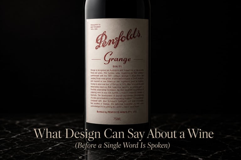
At Penfolds Magill Estate, in Adelaide, I was seated in front of a complete line-up from the winery: from Bin 21A to Grange. Seven bottles placed on an unadorned wooden table. And the first thing I thought when I saw the Grange was not the wine — it was the label. White. Almost artisanal. Cursive typography that looks handwritten. No embossing, no gold, no sign whatsoever of what it costs or what it represents.
In that moment, I understood something I had not been able to articulate until then: that label does not need to speak. It has been exactly that for decades, and that immutability is luxury.
When Penfolds celebrated its 180th anniversary, the special edition did not arrive in a more elaborate bottle. It arrived in a white wooden box, with an illustration of grapes in the graphic and urban style of NIGO — Japanese designer, creative director of Human Made, artistic director of KENZO. The gesture was the opposite of ostentation: more playfulness, more culture, more confidence that the wine inside did not need to be defended by the packaging, but accompanied by it.
A few weeks later, in Pessac-Léognan, I was seated in the tasting room of Domaine Clarence Dillon, with Château Haut-Brion 2017 and La Mission Haut-Brion 2017 in front of me. Two labels bearing the château hand-drawn, typography unchanged for generations, no concession to graphic modernity. And yet, no one who understands wine needs to read the full name to know what they are holding. The drawing of the château already says everything — origin, history, lineage, absolute seriousness.
These are two completely different visual languages. Yet they share something essential: neither of them is compensating for anything.
When Design Compensates, Something Is Wrong
I have seen wineries — without needing to name them — invest considerable sums in stamping, embossing, gold or silver foils, elaborate wax capsules. And then the wine does not correspond. Not necessarily because it is bad, but because the packaging promised something the content cannot sustain. The sophisticated consumer detects this immediately, even if they do not always verbalise it.
There is an even more revealing mistake: the winery that wants to position itself in the organic and natural segment — a legitimate, growing philosophy with a real audience — and chooses a heavy, dark, thick glass bottle to communicate premium positioning. The contradiction is not aesthetic. It is philosophical. The heavy bottle speaks of power, extraction, physical presence. Natural wine speaks of lightness, living soil, minimal intervention. The two messages cannot inhabit the same object.
That kind of incoherence is the visual equivalent of a discourse contradicting itself in its second sentence.
What Design Can and Cannot Do
Design does not create value. It reveals it — or betrays it.
A well-constructed label does not need to say the wine is complex, profound, elegant or exceptional. It suggests it through proportions, materials, typography, economy of elements. The consumer who knows how to observe reads all of this before reading a single word.
That is why design in fine wine is not a marketing decision. It is a philosophical decision. It answers a question that very few wineries ask themselves with enough honesty: what does this object promise before someone opens it?
If the answer does not align with what is inside, the packaging is not an asset. It is a symbolic debt.
Some Principles That Emerge After Years of Observing This Across Wineries on Four Continents
The brands with the greatest visual coherence are not necessarily those that invested the most in design. They are the ones that understood design as a system — not an isolated decision. The label, the paper, the weight of the glass, the capsule, the box, the tasting room, the staff uniform: everything forms part of the same language. When one of those elements becomes dissonant, the whole weakens.
The brands that endure do not redesign themselves because of trends. They evolve with intention and slowness. A label that changes every three years communicates — unintentionally — that the brand still does not know who it is.
And the brands that have impressed me most, in Barossa, in Stellenbosch, in Mendoza, in Bordeaux, are invariably those that possess something no design brief can manufacture: an identity so clear that the object simply expresses it, effortlessly, without explanation.
Grange does not need to tell you it is Grange. It already is.
