


Textures, Rhythms and Silences
The Aesthetics of the Invisible
3/5/2026

Introduction: What Is Not Said Also Builds Perception
The most admired luxury brands in the world share something in common: they do not need to explain themselves. They know that prestige is felt before it is understood, and that sensory nuances —even the imperceptible ones— are what truly move us.
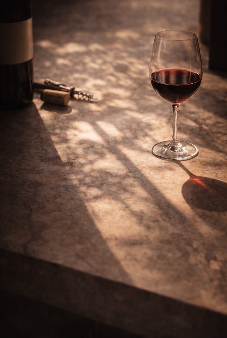
In the world of wine, this truth is even more evident. Not everything that creates impact is visible.
The sound of the cork being pulled, the light entering through a well-oriented window, the cadence with which a host serves the glass… all of that speaks. All of that positions.
Because in luxury, the invisible is not accessory: it is the emotional core of the experience.
What Is The Aesthetics Of The Invisible In Fine Wine?
It is a set of elements that do not communicate through words, but that build identity, desire, and symbolic value.
Textures that invite touch (labels, paper, furniture)
Rhythms that sustain the narrative (the pace of the visit, natural pauses)
Silences that legitimise (absence of noise, informational overload, commercial anxiety)
Château d’Yquem (France): its visits are not exuberant, they are meditative. The absence of hurry, the low tone of voice, the use of empty space… everything conveys respect for the wine, the visitor, and time.
How This Aesthetic Is Expressed At Every Touchpoint
Packaging Cotton paper, sober embossing, absence of graphic overload.
Spaces Controlled temperature, natural light, noble materials, restrained acoustics.
Hospitality Time to observe, silence between wines, serene tone, measured gestures.
Digital communication Coherent visual palette, use of white space, non-invasive editorial rhythm.
Biondi-Santi (Italy): a silent website, labels without artifice, time without concessions. Luxury does not justify itself. It expresses itself through meaningful omission.
Why the Premium Client Responds To This Aesthetic
Because they are saturated with stimuli.
And when they encounter a brand that breathes, that leaves space, that does not need to shout, they feel they are facing something superior.
This consumer does not want more information. They want:
A refined emotional tone
A non-invasive experience
A visual identity that includes them without overwhelming them
Clos Apalta (Chile): soft lighting, immersive architecture, intimate narrative. Silent luxury, deeply memorable.
Mistakes That Break The Aesthetics Of The Invisible
Using sophisticated materials without intention
Overloading spaces with objects without narrative
Invading the client with data, without emotional pause
Confusing minimalism with coldness
Silence must have content. It is not about saying less, but about saying it with greater aesthetic sensitivity.
How to Design A Brand That Speaks Through What It Does Not Say
Map the sensory spaces that define your experience What does your client see, hear, smell, and feel at each stage?
Curate the rhythm: eliminate what is unnecessary A well-placed pause may be worth more than any technical argument.
Design silence as part of your narrative Do not fill every space. Absence is also discourse.
Train your team to read gestures In luxury, body language matters as much as verbal language.
Conclusion: The Invisible Is The True Language Of Luxury
A brand that masters what cannot be seen or said —but can be felt— is a brand that builds emotional prestige beyond marketing.
🍷 Because in wine, as in music, silence is not emptiness. It is rhythm. It is tension. It is style.
