


Elegance with Intention
Aesthetics, Not Ornament
4/23/2026
Introduction: True Luxury Does Not Decorate — It Expresses
In a market saturated with visual stimuli and aspirational discourse, many brands confuse decoration with elegance, and the accessory with the essential.
But the high-end consumer is not impressed by the superficial. They seek brands that care for form not as disguise, but as language. In luxury, aesthetics is not an ornament. It is a strategic decision with symbolic intention.
And that is perceived in every texture, every visual silence, every designed line.
What Differentiates Curated Aesthetics From Empty Ornament?
Aesthetics with intention serves identity
Ornament seeks to capture attention without substance
Elegance communicates without saturation
Adornment shouts to compensate for lack of content
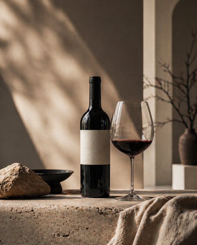
Sassicaia (Italy): its label is austere, without artifice. That sobriety sustained over time is its aesthetic and symbolic strength.
How This Difference Is Expressed In The World Of Wine
Packaging: Sober aesthetics, clean typography, visual balance. Nothing is excessive.
Architectural spaces: Noble materials, natural light, harmonious proportions. Beauty is not in impact, but in coherence.
Hospitality: Measured discourse, serene attention, details that are not displayed but are felt.
Communication: Images with visual weight, text with pause, selective editorial rhythm.
Bodega Garzón (Uruguay): integrated architecture, natural materials, elegant environmental discourse. Its aesthetics does not decorate: it builds a perception of authenticity and sophistication.
Why Aesthetics With Intention Elevates Perceived Value
Because it conveys care, discernment and symbolic maturity
Because it generates an emotional experience without explanations
Because it differentiates effortlessly
Because it communicates a brand that knows who it is and does not need to prove it all the time
The Macallan (Scotland): its new distillery is a silent architectural work. Its aesthetics speaks more of legacy than of visual impact.
Common Mistakes When Working On A Wine Brand’s Aesthetics
Adding elements without a clear symbolic function
Confusing luxury with opulence
Changing design constantly without coherence
Copying external styles without assessing their emotional fit
What distracts does not communicate. What exaggerates reduces trust.
How To Design An Aesthetic That Positions Without Overload
Define your emotional axis What do you want to evoke: serenity, mystery, clarity, desire?
Curate your visual language as part of the DNA, not of marketing Every label, every menu, every image must feel inevitable.
Fewer elements, more intention White space, visual rhythm and noble materials have a voice.
Multisensory coherence What is seen, heard and felt must speak the same language.
Conclusion: Real Elegance Is An Act Of Restraint, Not Excess
Because in luxury, what endures is not the most striking, but what is perfectly in its place. 🍷 And in wine, when everything communicates through form without imposing itself, the brand has already won in perception, desire and sophistication.
